

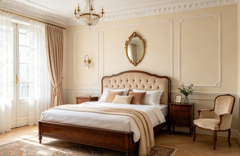
Creamy SW-7012 is one of those paint names that tells you exactly what you’re getting — a warm, creamy white that wraps a room in softness. But that warmth is also what trips people up. I’ve used it on walls and trim in two rooms, and the undertone behavior matters more than you’d expect. Here’s the breakdown.
What Is Creamy SW-7012?
Creamy is a warm white from Sherwin-Williams with an LRV around 81. That’s bright enough to function as a white in most settings but with noticeably more warmth than a neutral or cool white. It sits a step below true white and a step above a light cream — enough color to feel cozy without reading as beige or yellow on first glance.
It’s popular for walls, trim, cabinets, and exteriors. People reach for it when they want a white that feels warm and lived-in rather than stark and clinical. The name is honest — you get a creamy quality that softens everything around it. Just know that the warmth isn’t shy. It shows up.
Is Creamy SW-7012 Too Yellow?
That depends on your room, but the yellow is real. Creamy’s primary undertone is a soft yellow that reads as warm and buttery in favorable conditions. In rooms with lots of warm light, warm floors, or warm furniture, that yellow can stack up and push the color toward a more obviously cream or even light butter territory.
In balanced or cooler light, the yellow stays gentler and Creamy reads more like a warm white with just a hint of richness. I toggled it against a cooler white on Coloraw and the yellow base was clear in every lighting scenario — it never hides. If yellow undertones make you nervous, this might be too much. If you like the idea of warmth you can actually feel on the walls, it delivers.
Creamy vs. Alabaster — What’s the Difference?
Alabaster SW 7008 is the comparison you’ll always hear. Both are warm SW whites, both are wildly popular, and the chips look close. On the wall, the gap is real.
Alabaster has an LRV of 82 — just a point higher — but it carries less yellow. It reads as a warm white that manages its warmth quietly. Creamy commits harder. It’s more obviously cream-toned, more yellow, and more likely to make you think “warm” the second you walk in. If you want warmth that stays subtle, Alabaster is the safer pick. If you want warmth you can actually see and feel, Creamy goes further. I’d say Alabaster is the diplomatic warm white. Creamy is the one that picks a side.
How Does It Look in Different Lighting?
South-facing rooms push Creamy the warmest. All that direct sun amplifies the yellow undertone, and the color can lean solidly into cream territory. If your room is already filled with warm finishes, that might be more warmth than you bargained for. It’s worth seeing before committing.
North-facing light cools things down and actually works in Creamy’s favor for some people. The cool indirect light tames the yellow enough that the color reads as a balanced warm white without tipping into butter. East-facing rooms shift from cooler mornings to warmer afternoons. West-facing rooms glow golden by evening, which can push the warmth hard.
For bulbs, 3000K LEDs are your friend. Going down to 2700K adds more yellow to a color that already has plenty. Cool daylight bulbs wash the warmth out and you lose the whole point of choosing Creamy.
Does Creamy SW-7012 Work on Exteriors?
Really well. At LRV 81, Creamy reads as a clean warm white on the outside of a house. Direct sunlight actually tames the yellow slightly — you get a warm glow without the color looking obviously cream. It hits a nice spot between sterile white and noticeable color.
It’s a popular choice for traditional homes, farmhouse-style builds, and anywhere you want a white exterior that feels friendly rather than cold. In shade and under overhangs, the creamy quality comes forward more — you’ll see extra warmth on those surfaces. Pair it with dark shutters, a bold front door, or natural wood accents and the warmth earns its keep. If you want zero yellow on your exterior, look at something cooler like Pure White SW 7005. But for a warm exterior white, Creamy is a strong pick.
What Trim Color Pairs Best With Creamy?
If Creamy is your wall color, Extra White SW 7006 is a solid trim choice. It’s cool and clean enough to create visible contrast and let Creamy read clearly as a warm color. The line between wall and trim is crisp.
For a softer approach, use Creamy on both walls and trim in different sheens. Flat on walls, semi-gloss on trim. The sheen difference gives you definition without a color break. I checked Creamy SW-7012 on Paintuma against several trim options on real room photos, and the tone-on-tone approach looked surprisingly polished — the warm light bouncing off the semi-gloss trim gave just enough distinction. If Creamy is your trim color alongside darker walls, it pairs well with warm greiges, soft greens, and muted blues.
What Are the Closest Matches From Other Brands?
Benjamin Moore White Dove OC-17 is the most commonly cited cross-brand match. Both are warm whites with a similar depth. White Dove carries a slight gray quality that Creamy doesn’t — it reads a touch more complex and slightly less yellow. If Creamy’s yellow worries you, White Dove might feel safer while still giving you warmth.
Benjamin Moore Swiss Coffee OC-45 enters the conversation too. It’s warm and creamy by name and nature, but the BM formula reads a bit different — slightly more saturated, slightly more pigmented. The two are close enough that you could swap them in many rooms and be happy. For an exact match at another store, bring a painted sample. Warm whites are deceptively hard to replicate from small chips.
Should You Sample Creamy Before Buying?
Yes — and pay close attention to the yellow. Creamy interacts with everything around it. Warm oak floors, warm-toned countertops, and south-facing sun all amplify the yellow undertone. A room that looks balanced in the morning might feel like butter by afternoon.
Paint a large swatch on two walls. Watch it in different light through the day. Stand back and ask yourself honestly: does the yellow bother me? Most people either love it or want to pull back to something like Alabaster. There’s usually not much middle ground.
For a quick preview, paintcolorvisualizer.com lets you upload a photo of your own room and test the color for free. It works for both interior and exterior shots. It won’t replace paint on drywall, but it gives you a fast read on whether the warmth level fits your space.
Bottom line: Creamy SW-7012 is a warm white that fully commits to its warmth — no hedging. Test it in your actual light, pair it with the right trim, and you’ll know fast if that yellow undertone is your friend or your dealbreaker.
