


Mobile-friendly websites perform better in search because Google prioritises the mobile version when crawling and ranking pages.
Yet, many site owners still optimise for desktop first and assume mobile will sort itself out (it rarely does). We see this mistake regularly during our website audits at Matter Solutions. Businesses are often left with slow-loading pages, poor navigation, and layouts that break down on smaller screens.
That’s exactly what this guide addresses. It covers what Google looks for on mobile, where most sites fall short, and what a properly optimised site looks like in practice.
By the end, you’ll know whether your site has a problem and what to do about it.
Google Ranks the Mobile Version of Your Site First
Google uses mobile-first indexing as its default for all websites. That means when search engines crawl your site, they look at the mobile version first.

What’s more, 65.71% of all global web traffic now comes from mobile devices. So if your site struggles on a smaller screen, that’s the version Google is scoring you on. A strong desktop experience is still important, but it won’t offset problems with the mobile portion of your site.
Better User Experiences Keep Visitors Engaged
When a visitor lands on your site from search results, you have only a few seconds to make a good impression. If the page loads slowly, text is hard to read, or buttons are difficult to use, many visitors leave before finding what they need.
The opposite happens when a site is easy to use on a phone. Visitors stay longer, view more pages, and are more likely to complete actions such as filling out a form or making a purchase. These behaviours suggest a positive user experience and can support a site’s ability to maintain its visibility over time.
How Core Web Vitals Influence Search Visibility
Core Web Vitals influence search visibility by showing search engines whether a page provides a fast, stable, and responsive experience for visitors. Google breaks this down into three specific metrics:
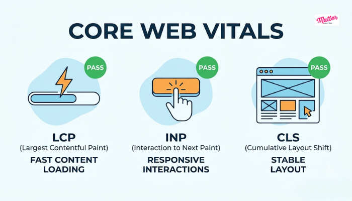
- Largest Contentful Paint (LCP): This metric looks at how quickly the main content appears after a visitor opens the page. Google recommends an LCP of 2.5 seconds or less. Any slower, and visitors may leave before the main content has fully loaded.
- Interaction to Next Paint (INP): Visitors expect an immediate response when they tap a button, open a menu, or submit a form. INP measures the delay between the action and the page’s reaction. If the delay is noticeable, the site can feel sluggish even when it loads quickly.
- Cumulative Layout Shift (CLS): Imagine tapping a button just as it moves down the page, or starting to read a paragraph only for it to jump out of position. CLS is the score Google uses to measure that instability.
Sites that score poorly across these metrics give Google enough reason to rank competing pages above them. Each metric targets a different part of the loading experience, so a problem in any one area can affect where the page appears in search results.
Why Responsive Design Doesn’t Always Mean Optimised
Responsive web design is often treated as the finish line for mobile readiness. In reality, it’s the starting point.
Believe it or not, a responsive website adjusts its layout to fit different screen sizes, but it doesn’t automatically improve loading speed, responsiveness, or usability.
Below are some of the most common issues that responsive web design alone won’t resolve:
- Uncompressed Images: Large image files slow down load times regardless of how well your layout scales.
- Render-Blocking Scripts: When scripts delay content from loading, visitors have to wait before they can interact with the page.
- Small Tap Targets: Buttons and links sized for a mouse cursor often turn into a frustrating guessing game on a touchscreen.
- Server Response Times: Server performance affects how quickly content reaches visitors. A slow server can delay loading even when the front end is well optimised.
When we audit sites, most of these issues don’t show up until we run a proper performance test. That’s exactly why so many businesses assume they’re covered on mobile, when the real issues are sitting a layer deeper than the layout.
How to Tell If Your Site Has a Mobile Usability Problem
You don’t have to be a developer to find out whether your site has a mobile usability problem. A few free optimisation tools from Google will tell you exactly where the issues are. And most of them take less than five minutes to run.
The best place to start is Google Search Console. It’s free, and you don’t need any technical background to use it. Once you’re signed in, head to the Mobile Usability report. There, you’ll see specific issues like text that’s too small to read or clickable elements that are too close together.
From there, run your URL through PageSpeed Insights. It digs deeper than Search Console and returns a mobile performance score alongside a full breakdown of what’s slowing the page down. It also pulls in your Core Web Vitals data.
And if you want a fast check, Google’s Mobile-Friendly Test gives you a simple pass or fail for any page in seconds. It won’t go as deep as the other two, but it’s useful when you just want to confirm a page is performing well before moving on to the next one.
We suggest running all your important pages through all three. That way, you’ll catch most of the problems worth fixing.
What a Well-Optimised Site Actually Looks Like
A well-optimised site consistently delivers a smoother experience across all screen sizes, and that shows up in both rankings and conversion rates.
Two things separate a genuinely optimised site from one that’s merely passable. First, text stays readable without the visitor having to pinch or zoom. If your visitors are reading on a five-inch screen, your font size and line spacing need to match.
Second, the layout should adapt smoothly across different screen sizes. Most mobile browsers display pages between 360 and 430 pixels wide. So content, images, and navigation elements need to fit within that space without forcing visitors to scroll sideways or deal with broken layouts.
Everything else, including fast loading, compressed images, and tappable buttons, plays a supporting role. And together, these elements make up a site that works as well for a visitor on a phone as it does for one on a desktop.
Quick Tip: Revisit your mobile performance at least once every few months. Devices and screen sizes change regularly, and a score that looked fine six months ago may not meet Google’s current expectations.
Your Mobile Experience Is Your Ranking Signal
Your site’s mobile experience feeds directly into how Google scores every page you publish. Load times, layout stability, content visibility, and tap usability all factor into that score. A weakness in any one area can limit how effectively your pages compete in search results.
Fortunately, most mobile issues are fixable once you know what to look for, and this guide has walked you through exactly that.
If you’ve run the tools from the previous section and found problems, or you’re not sure where to start, the Matter Solutions team can help. We regularly audit websites to uncover mobile issues and identify practical improvements that support better search performance.
Get in touch, and we’ll tell you what’s holding your site back.
Frequently Asked Questions
Still have questions about mobile SEO? These are some of the most common ones we come across.
How do I improve mobile optimisation on my website?
Start with the three tools covered in this guide: Google Search Console, PageSpeed Insights, and Google’s Mobile-Friendly Test. Between them, they’ll surface the most common mobile usability issues. From there, prioritise fixing page speed, tap targets, and content visibility before moving on to finer details.
What makes good mobile design for SEO?
Good mobile design keeps things simple and functional. Text should be readable without zooming, buttons should be easy to tap, and the layout should stay stable as the page loads. A mobile-friendly site should also make important content easy to access, rather than hiding information that appears on the desktop version.
Do responsive images affect mobile SEO?
Yes. Responsive images scale correctly across different screen sizes, which prevents oversized files from slowing down the page on mobile devices. Since page speed is a ranking factor, unoptimised images can drag down your search visibility even when everything else on the site is well set up.
